Using Storybook.js with Agility CMS and Next.js
Storybook is an open-source tool for building UI components and pages in isolation. It streamlines UI development, testing, and documentation. You can use Storybook to manage all of your UI components, which act like Lego blocks for your developers, and then map those to Page Modules in Agility, bringing the power of those components to your content editors.
Let's dig into how this can work on top of the Agility CMS starter project for Next.js.
Step 1: Agility CMS + Next.js
To get started, create an Agility instance with the Next.js Blog starter project and get the code running locally from github.
git clone https://github.com/agility/agilitycms-nextjs-starter- Run
npm installoryarn install - Rename the
.env.local.examplefile to.env.local - Retrieve your
GUID,API Keys (Preview/Fetch), andSecurity Keyfrom Agility CMS by going to Settings > API Keys.
Test things out by running npm run dev or yarn dev
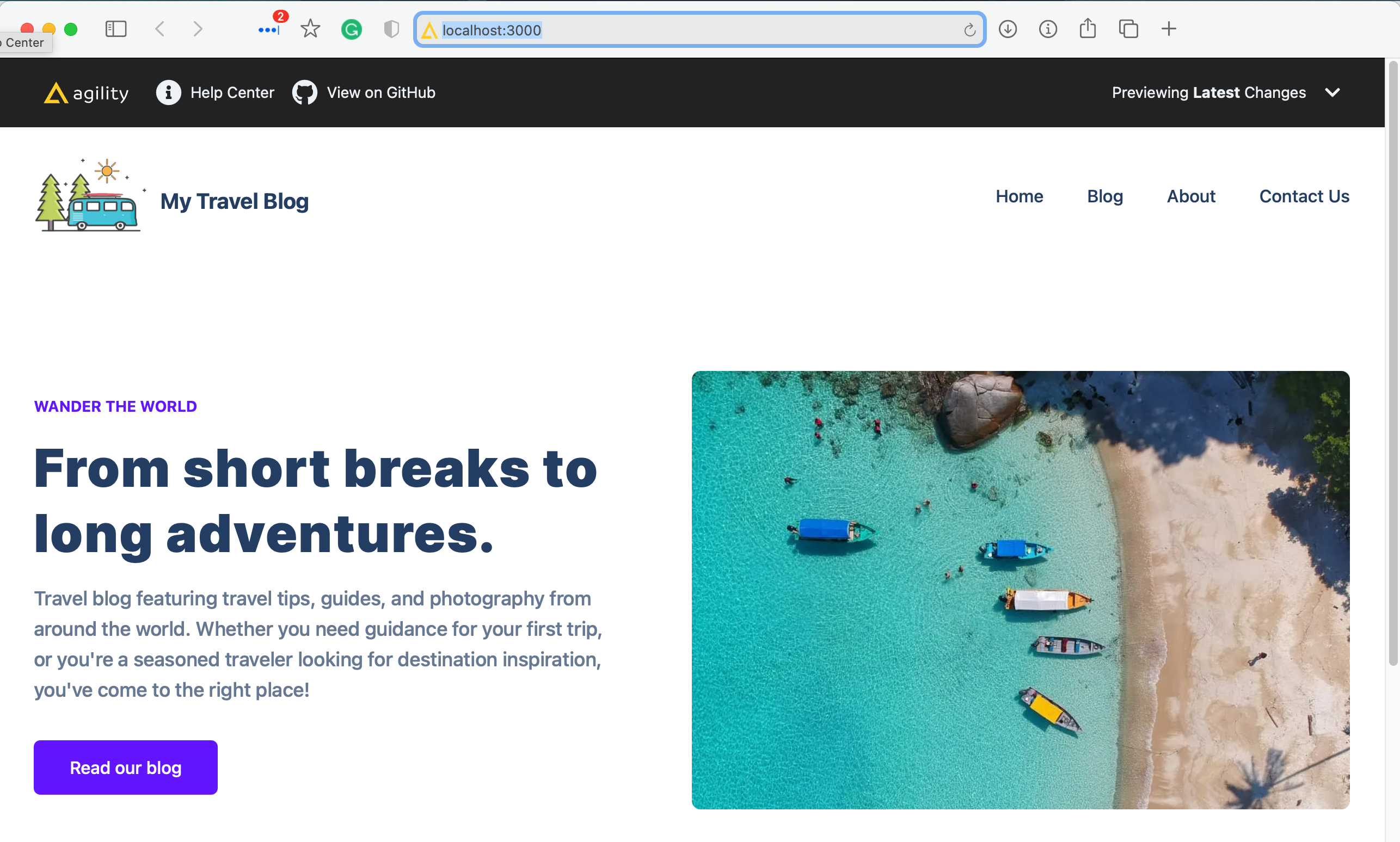
Once you get everything running, you should be able to run the home page of the blog starter in your browser at http://localhost:3000
Step 2: Install Storybook.js
We are going to be following along (roughly) with the docs for installing Storybook on top of React.
Before we actually install Storybook, though we need to tweak a few things (due to Tailwind's use of PostCSS 8). Inside the same project you just got running (congrats, btw! 🥳), run the following:
# FOR YARN
#remove the base tailwindcss etc
yarn remove tailwindcss postcss autoprefixer

#add them back in
yarn add -D tailwindcss@npm:@tailwindcss/postcss7-compat postcss@^7 autoprefixer@^9
# FOR NPM
#remove the base tailwindcss etc
npm uninstall tailwindcss postcss autoprefixer
#add them back in
npm install -D tailwindcss@npm:@tailwindcss/postcss7-compat postcss@^7 autoprefixer@^9We're ready to actually install Storybook.
npx sb initThe command above will make the following changes to your local environment:
- 📦 Install the required dependencies.
- 🛠 Setup the necessary scripts to run and build Storybook.
- 🛠 Add the default Storybook configuration.
- 📝 Add some boilerplate stories to get you started.
Next, we need to update the .storybook/main.js file to tell Storybook where to look for the stories:
module.exports = {
  "stories": [
    "../stories/**/*.stories.mdx",
    "../stories/**/*.stories.@(js|jsx|ts|tsx)",
    "../components/**/*.stories.@(js|jsx|ts|tsx)"
  ],
  "addons": [
    "@storybook/addon-links",
    "@storybook/addon-essentials"
  ]
}
We also need to add our globals.css file to the .storybook/preview.js to enable Tailwind:
import '../styles/globals.css';

export const parameters = {
  actions: { argTypesRegex: '^on[A-Z].*' }
};
Now you're ready to run Storybook!
#YARN
yarn storybook

#NPM
npm run storybook
It will start Storybook locally and output the address. Depending on your system configuration, it will automatically open the address in a new browser tab and you'll be greeted by a welcome screen.
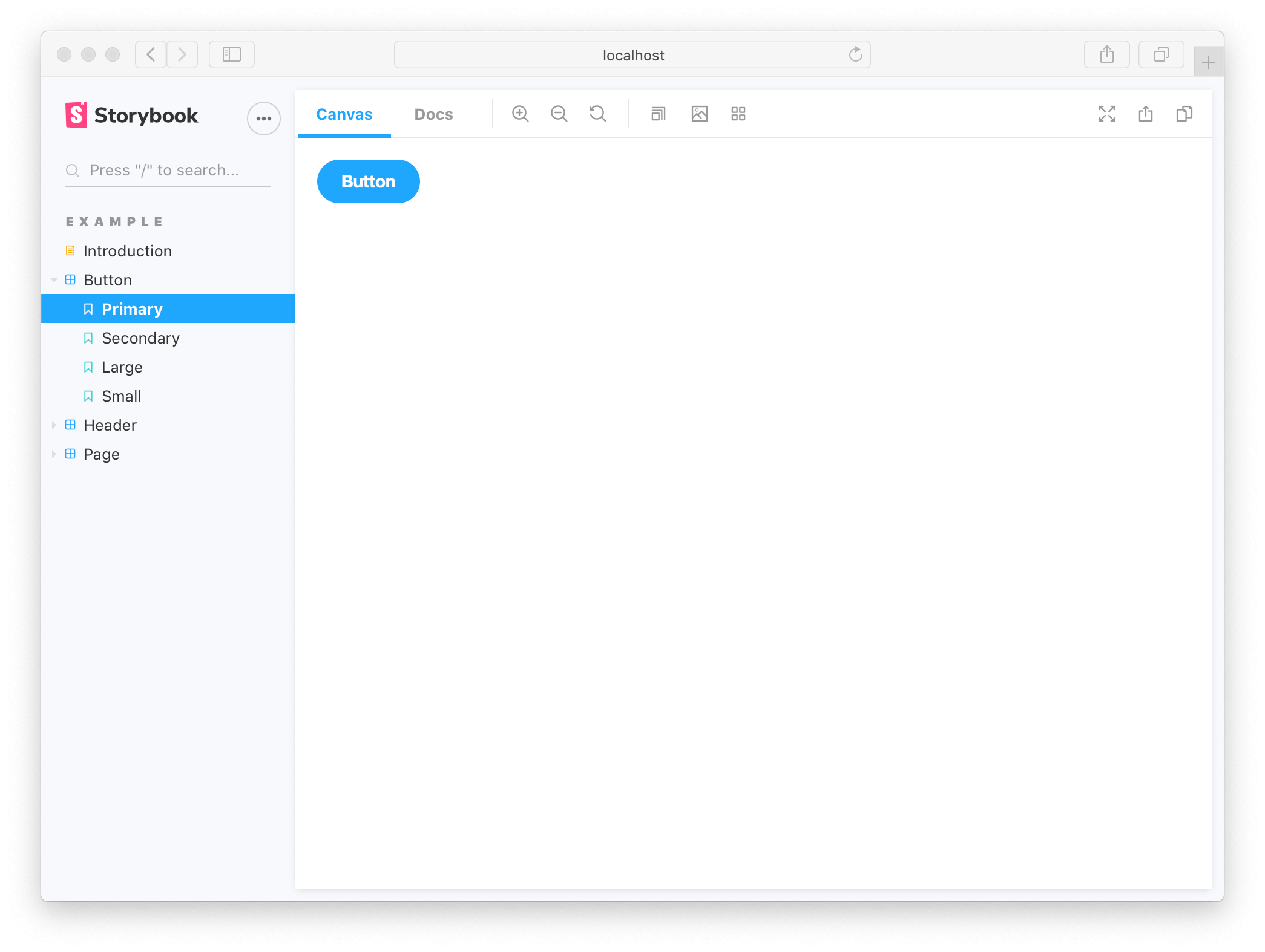
Now that you have everything installed, I recommend doing a little reading (if you haven't already) on how stories work.
Step 3: Create A Story from a Module Component
We're going to be create a store for the TextBlockWithImage.js component.
Image fix
Since that component is currently using the Next.js Image component, we need to add a format method to it to avoid a bug with Storybook.
Add this method to the component:
const loader = ({ src, width, quality }) => {
  return `${src}?width=${width}q=${quality || 75}`
}
And update the <Image> components in there with that method:
<Image
 src={fields.image.url}
 alt={fields.image.label}
 width="768"
 height="512"
 className="rounded-lg object-cover object-center"
 loader={loader}
 />
The Story file
Go ahead and create a file in the same folder called TextBlockWithImages.stories.js and initialize it with the following code:
import React from 'react';
import TextBlockWithImage from './TextBlockWithImage';

//👇 This default export determines where your story goes in the story list
export default {
  title: "Agility-Modules/TextBlockWithImages",
  component: TextBlockWithImage
};

//👇 We create a “template” of how args map to rendering
const Template = (args) => <TextBlockWithImage {...args} />;

export const TextBlockWithImageStory = Template.bind({});

TextBlockWithImageStory.args = {
  /*👇 The args you need here will depend on your component */
  module: {
    fields: {
      title: "Example Text Block with Image",
      tagline: "Storybook + Agility CMS",
      primaryButton: {
        text: "Read our blog",
        href: "/blog",
        target: "_self"
      },
      image: {
        url: "https://cdn.aglty.io/blog-starter-2021-template/posts/gaddafi-rusli-2ueUnL4CkV8-unsplash%201.jpg",
        label: "A book on a table"
      },
      imagePosition: "right",
    }
  }
};
There are 3 things happening in the code above:
- The default export is a title and component that tells Storybook about this component and its title.
- The "template" for this component that Storybook will render.
- The default "args" for this component. Normally this data would come from Agility CMS, but in this case we've hard coded it.
Check your browser - you should see something like the following when you click on the TextBlobWithImages story.
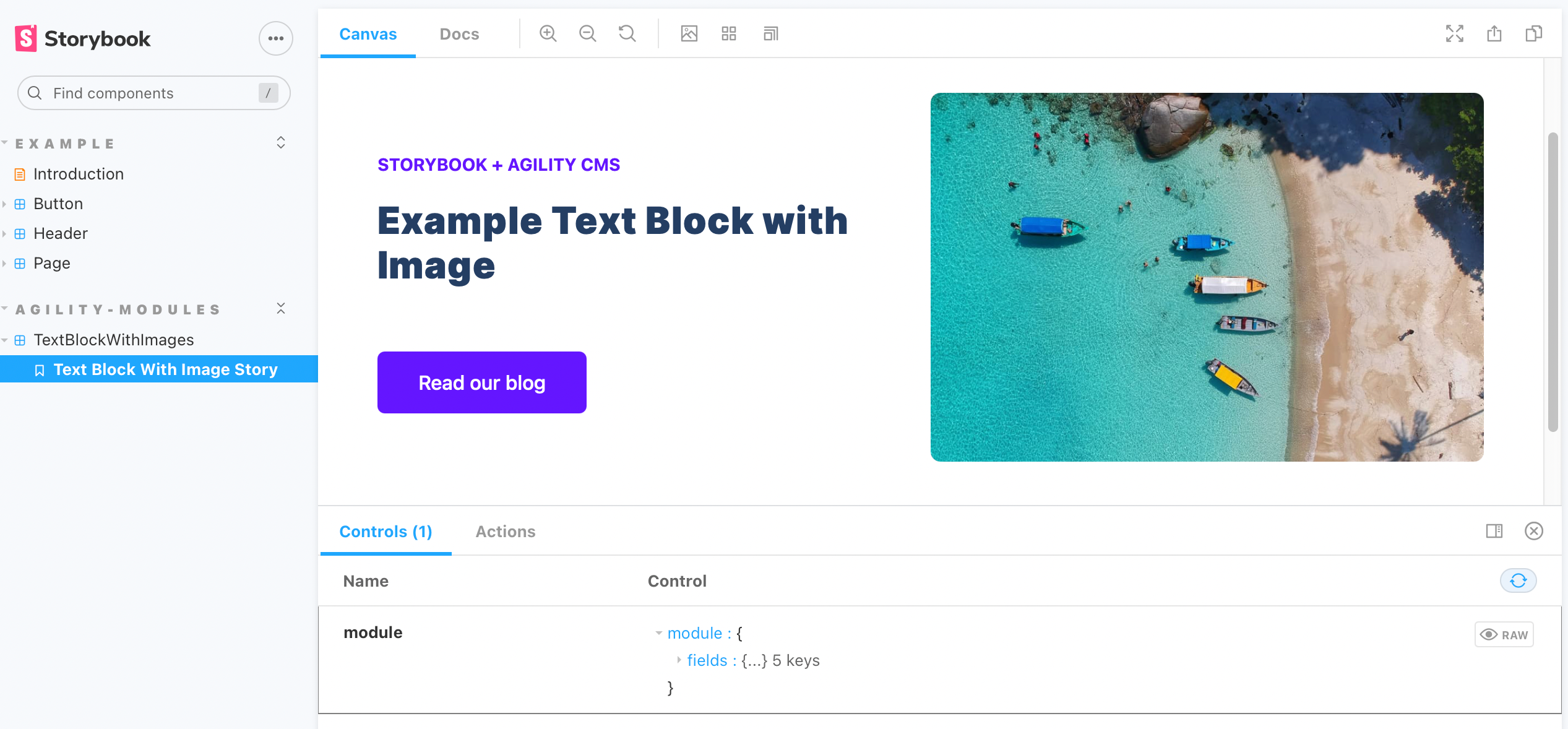
That's it, you've created your first Storybook component!